‘Would you be interested in writing a short blog we can post, to help other students try new things?’
‘Yes, definitely’
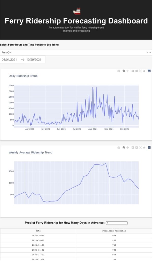
It has been some days after the first Ocean of Data Challenge came to an end. For a quick recap, the challenge was to use open-source ocean data to explore the opportunities with the proposed Bedford Ferry. Choosing the “Around the Water” stream, my team and I used data from the Halifax Regional Municipality. We made a prototype integrating ARIMA model for ferry ridership prediction with trend analytics and won the best design prize. During the challenge, my team didn’t deploy it to a server but showed it in a Jupyter Notebook. Though the competition is over, the learning process continues. To make it complete and productionize the idea in the days after the challenge, I tried to deploy the prototype to a website using Dash Plotly.
What is Dash? Why Use it?
Although there may be tons of descriptions about how powerful Dash is, I’ll try to make it as simple as possible. Imagine you developed a good ML algorithm in a competition, in-class projects or even in real work environment. The next thing bumping into your head must be how do I let other people/my boss acknowledge my work and see that my fancy ML model really does work! Because you know you can’t just show hundreds or thousands of lines of code to your audience, it won’t really mean anything to them.
In the traditional way, to address this issue, you need to write the whole front-end/back-end and integrate your model, then figure out a way to make sure everything is compatible and deploy it to a server. I bet you have already imagined what a struggle it would be to make all this work. However, with Dash Plotly, you can easily design and deploy your model using pure Python and let Dash take care of full-stack development part. It’s cool, isn’t it? Not to mention that Dash provides tons of front-end functions to make sure your website looks pleasant to your audience even if you have less experience in web design.
In this way, you can easily make your model come to life on a website by writing few lines of code and showing it to the world!
How to Learn Dash? Any Shortcuts?
Always learn with a purpose.
Always start with a clear goal of what you want to achieve in the end, whether it is an in-class ML project or a brilliant idea you want to develop into a product. For me, it is to deploy my prototype designed during the challenge. The purpose is just like a scenario created for your skills to put into use. During the process, a clear purpose will push you to learn many new things and make you feel a great sense of achievement in the end. If you learn Dash without a clear picture of where you want to go, you will most likely get stuck in the details and end up nowhere.
Learning by doing.
The basic process of launching Dash APP is to first do experiments and model tuning in Jupyter Notebook, wrap-up data pipelines, visualization and modelling into well-structured functions, then design the website layout and deploy it using free servers like Heroku. For me, the most time spent is designing the website layout and the callback functions.
Because I had little experience in web development, I first picked some Dash App Gallery examples to replicate some of them. During this process, I still remember I googled everything, opened over 50 tabs, spent day and night working on it and never felt tired. This process helped me quickly grasp knowledge needed for designing my APP and reviewing CSS and HTML basics. What’s more, I also learned to properly use Git for version control and code management because of the needs for Dash APP deployment.

Learning by doing is always a great process to ‘touch new things’ especially in an IT field. Everyone is learning something new and figuring things out during the process. You can’t wait for every bit of knowledge to be prepared for you to get started. Just start from nothing and add them up gradually. Trust me, you will surprise yourself!
Strong Encouragement for Participating in ‘Practical Data Challenges’
Actually, this is not my first-time doing data related challenges. However, the main difference between this Ocean of Data Challenge and the famous Kaggle competition is ‘Practicality’, which makes it more fascinating than traditional Kaggle competitions which is only about chasing higher scores. In Kaggle, competitors win because of achieving the highest scores regardless of whether the solutions could be put into industrial use.
However, practical data challenges or Hackathons focus more on well-structured solution design empowered by data science for better addressing business problems in a doable way. In this case, we can really think about business side by asking questions like, “Does my model really work? Is it suitable for the given context? Does it address current problems?” With more and more people participating in these challenges, sparkling ideas will be generated that can really make a change!
Getting Started with Plotly:
Though there are many resources, this official documentation is the easiest to get started with, from installation to advanced usage to deployment. Just follow it step by step, it’s very detailed: https://dash.plotly.com/
Dash Bootstrap Components: https://dash-bootstrap-components.opensource.faculty.ai/
Dash deployment on Heroku: https://dash.plotly.com/deployment
Git: https://product.hubspot.com/blog/git-and-github-tutorial-for-beginners
About the author
Chu Wang is currently a Graduate student at Dalhousie University in Master of Digital Innovation – Data Science. Previously he has worked as a Data Analyst at Tencent and Jobster.io. He was been top ranking in several Kaggle competitions, first prize in the China National AI Competition, and most recently, his team best design at the Ocean of Data Challenge: The Bedford Ferry from DeepSense and COVE.
